
The Origin G began as my search for a mark that could represent Green Religion, something as simple and ancient as a symbol made before words, yet alive enough to carry our mission today.
In Miami, when I walk my dogs beneath the wide arms of Live Oaks, Royal Poincianas, Octopus trees, and Wild Tamarinds, I’m reminded that it’s silly to even say I “connect” to nature. I am nature.
That phrase carries personal weight for me. Growing up on Eastern Long Island, I once stood on the barn studio floor of Jackson Pollock, the renowned painter who famously declared to fellow artist and teacher Hans Hofmann: “I am nature.” Pollock’s words captured a moment of visionary confidence, an insistence that the artist’s inner life and the natural world were inseparable. Many creatives still feel the charge of that declaration today.
For me, Pollock’s words are not something to measure against but a reminder of what I live daily. Green Religion begins there: in the recognition that the canopy above, the ground beneath, and the body moving through both are not separate. I walk with Green Religion 24/7. The canopy is not just above me; it is me, and all of us.
This sense of inseparability runs through Green Religion. It surfaces in our stories, like this month’s Voice of the Canopy: Dr. Scott Brown Reveals the Green That Heals, where we honor a dear friend and environmental steward. It flows into the playful word-images we have developed recently, For Now and Before We Spoke, short, punchy refrains that spark curiosity, echoing the early symbols and markings humanity made long before language.
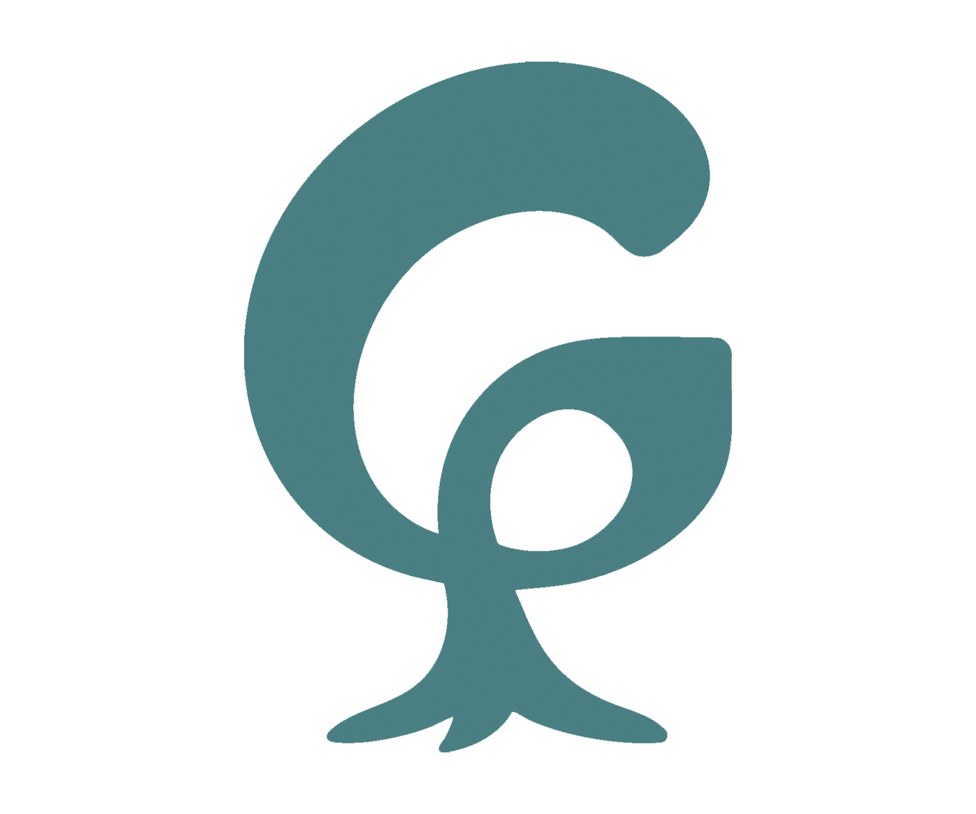
The Origin G grew from that current. It shifted between playful references, dinosaurs and their clunky steps, and Gumby, the silly, claylike childhood icon who welcomed me to many mornings.
Gumby’s creator, animator Art Clokey, was more than a pioneer of clay animation; he was a spiritual seeker and early environmental advocate. Clokey infused Gumby’s world with messages of care, love, and goodness, drawn from his explorations of Buddhism, Christianity, and other paths. These influences were philosophical rather than overtly religious, much like Green Religion’s mission today, eco-spiritual in nature, built on respect for Earth rather than devotion to a deity. Clokey chose Gumby’s green to symbolize chlorophyll and our essential connection to the planet, and that choice always stayed with me. Gumby’s flexible, claylike form inspired how I shaped and reshaped the G, reminding me that humor, imagination, and advocacy can share the same line.
While Gumby’s green carried ecological hope, I chose not to replicate it in the Green Religion identity. That decision came in collaboration with artist and writer Erin Parish, a Circle member, who guided the design phase toward a teal, a meeting point of grass and sea. This hue became the final logotype color for Green Religion, a tone that speaks to Miami’s landscape and our broader vision: where canopy and coastline meet, and where healing must hold both land and water in balance.

Unbounded Identity and Fulano Collaboration
My collaboration with Fulano Inc. and creative director Leyden Rodriguez gave Green Religion its website identity and design foundation. Together, we selected Unbounded, a typeface that feels fresh, free, and forward-looking, an identity that could stretch beyond limits while holding space for openness and care. The Green Religion website reflects that sensibility with its balance, flow, and clarity, making space for both design and mission to align.
At one of our earliest logo meetings, Leyden pointed out the inner counter (inner space) of the lowercase g in Unbounded, that quiet, petal-shaped form within. It stayed with me. That shape reminded me of the leaf of the Autograph tree, a Florida native, and of the bloom of the Plumeria, or frangipani, which is not native. As design imagery, the resemblance carries a quiet dichotomy: the natural occurrence of what belongs and the migration of what does not, and the ecological questions that arise when non-native life takes root.

Studio Reflection: The Emergence of the Origin G
I first chose and shared with AI a playful, somewhat goofy-in-stance drawing of a tree, a minimal colored pencil sketch of mine. From that starting point, the G began to shift. After AI had its turn, I brought the form back to the drafting table. Pencil in hand, I began reducing and reshaping, always returning to that lowercase g and its petal-like core.
It is worth noting here that I used ChatGPT’s image generator as part of that early play. While the tool sparked movement, I have since learned more about the environmental costs tied to such technologies, including heavy water and energy use, sometimes at the expense of vulnerable communities. That complexity will be explored more fully in a forthcoming Green Religion story. For now, I hold both truths: the creative spark it offered, and the environmental fragility we must not ignore.
At my table, and later with a bit of graphic program play, that small inner space became the key. The lowercase g stretched upward, transforming into a tall, tree-like uppercase G that still carried its inner petal within. Voila.
The name Origin G came from me as I searched for a language that could hold both the simplicity of a mark and the vastness of what it represents. I wanted something that spoke to the first life form taking its first movement, the first gesture that set everything else into motion. For me, Origin G is that beginning and that grand gesture at once, a reminder that what we create today belongs to the same continuum of life that moves through us all.
From the start, my ambition was to create a mark, a logo, even a kind of icon that could represent Green Religion. I’ve long believed that a symbol can carry meaning in ways words cannot, as ancient marks once did before spoken language. The Origin G is our curious and playful emblem for now, one that seems to have its own verve, ready to walk around and promote Green Religion wherever it goes.
For me, that moment felt like having the last word in a marriage between my muse and my design instincts, and yes, perhaps some healthy ego. The Origin G is out now for review and discussion, carrying with it the mix of instinct, humor, and determination that defined its making. I swear it moves in verve, like a journeying elephant or some early, pea-brained T. Rex: awkward, majestic, ancient, and striding forward all the same.
Green Religion is listening—whenever you’re ready.
Explore the growing space of Green Religion where stories connect us, creativity leads to awareness, and climate justice remains at the core.
We value your privacy. Your email address and personal information will be used solely for sending updates from Green Religion. We do not share your information with outside parties, and you can unsubscribe at any time.